Indicators! What are They Good For??As traders, we all have personalities that drive what we like and what we should avoid! This article is meant to illustrate how to find indicators that are useful for finding market conditions with certain trade characteristics. It is assumed that the reader has some familiarity with indicators and typical conditions of interest. This will NOT be a comprehensive article covering all indicators and their uses. I'm not a details type of person, so I partner with technology to help me take care all the fussy details that go with trading. Analyzing my own trades is sometimes painful and frustrating. I've attempted to classify the reasons a trade doesn't work out. It's really frustrating when I've got the direction correct, but didn't take enough risk and got stopped out. Sometimes I ask too much and a trade that would have helped the bottom line ends up as a scratch. Sometimes I get the direction wrong only to observe some obvious signs after the fact. To that end, I've keep track of four primary metrics and one additional metric that is useful when attempting indicator combinations. I find five metrics to be of use, in no particular order.
For this evaluation of the mentioned five metrics, we'll contain the problem/solution space by putting constrains on the data.
Here is the list of indicators used and the test condition for this article: The same settings were used for both markets under evaluation.
On each chart, the 'baseline' will be listed so we can compare against each indicator. The baseline calculation is performed using all market data and no conditions. DirectionLots of traders would love to know what direction to trade in. What can these indicators tell us about direction? 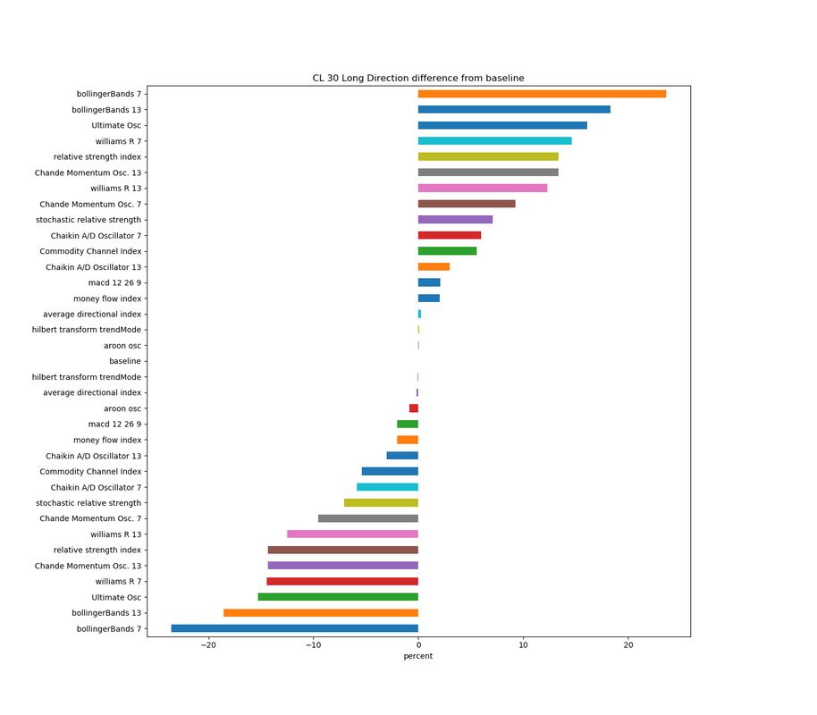 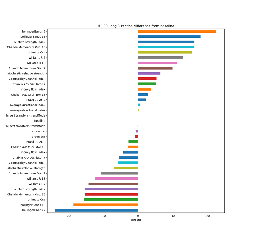 These charts show us that Bollinger Band, Ultimate Oscillator and William %R are among the best of this set at detecting market direction while indicators like ADX(average direction index) and Hilbert transform have very little effect on being able to predict direction. However, direction by itself is nowhere near the complete story. We must consider some of the other factors to understand what an indicator may tell us. Risk!Risk, Risk Risk! The previous charts showed us that some indicators are much better than others at detecting market direction. What about risk? Do any of the indicators affect the risk taken when entering a trade? When we consider the effect an indicator has, we will consider the mean, the standard deviation, and the mode. The mode will not be shown, because most indicator don't effect the mode, but we'll discuss the one indicator that does. 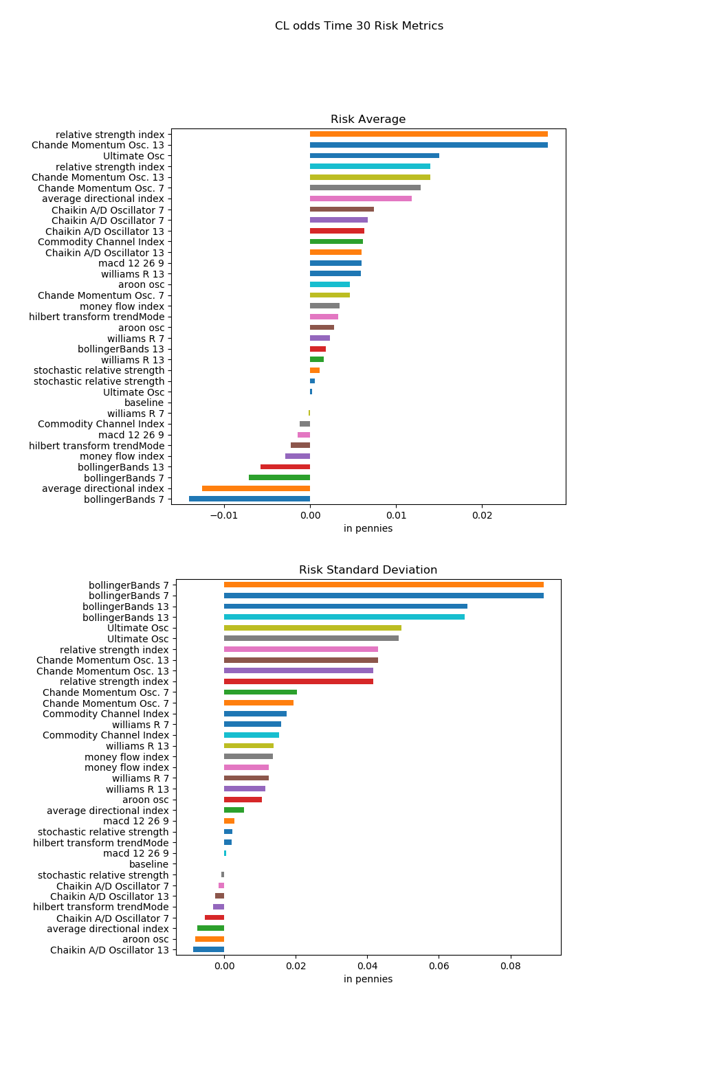 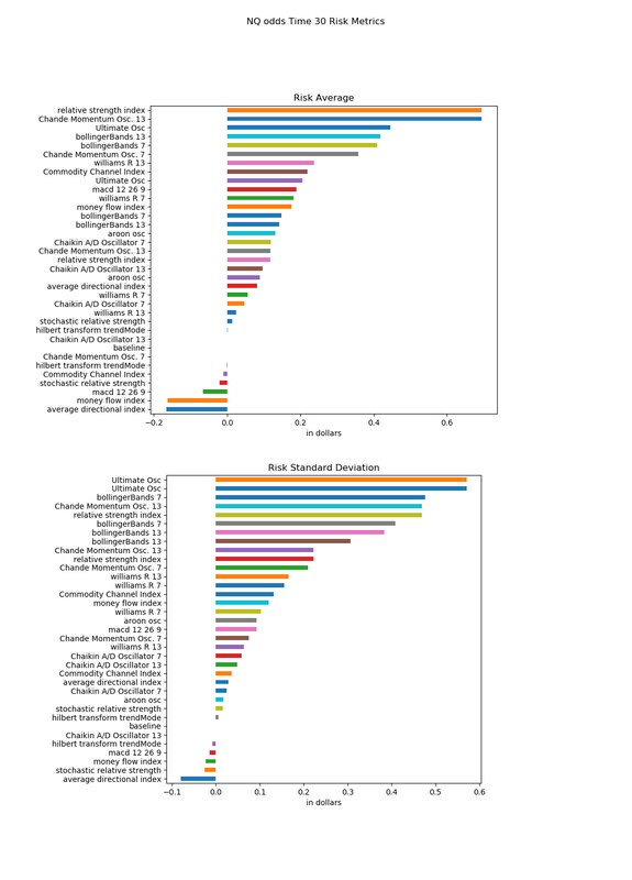 These charts tell us that most indicators increase the amount of risk. The Average Directional Index is one of the view that both decrease the risk AND the standard deviation. The Hilbert transform to detect trending or not also decreases both the risk and standard deviation, although not by a large amount. Something very interesting is shown here. Check out the Bollinger Bands both 7 and 13. It's shown that they decrease the risk, but they also are at the top of the chart increasing the standard deviation. The mode (most commonly occurring) (not shown) also increases for the Bollinger Bands. So what's going on here and what's another way to look at this? If the mean decreased but the standard deviation increases, this indicates that we should take a look at the distribution for the risk data. To save space, I'll only look at the CL market, but the same effect is present in NQ also. 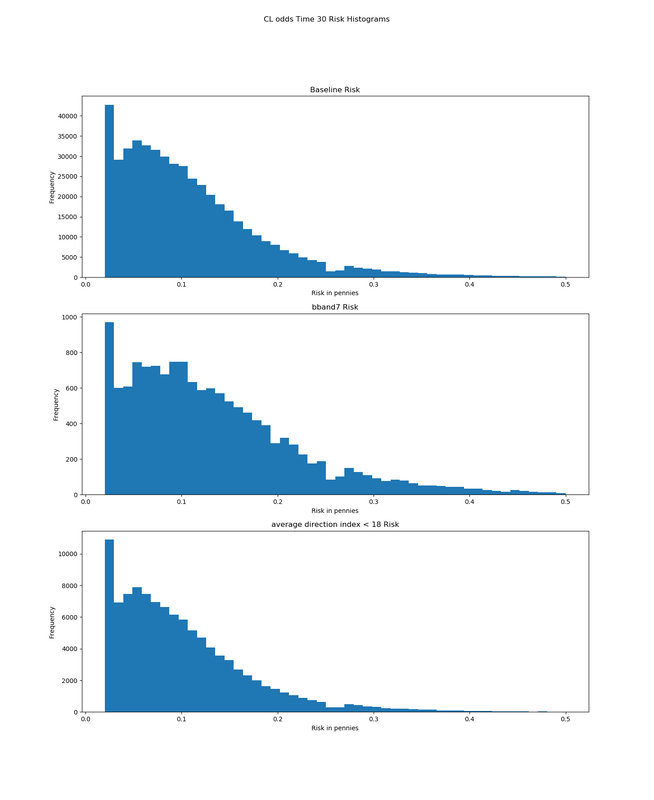 Note the difference in shape of the histograms. The top chart is the baseline, capped at .50 cents risk. All risks are assumed to be at lease .02 cents (thus the spike starting at .02). The larger standard deviation of the Bollinger Bands gives a fatter/flatter distribution, which is enough to move the mode several pennies (ticks for CL) larger. Notice the ADX histogram can reduce risk but the shape of the histogram is very similar. Risk by itself is somewhat boring without looking at the reward parts too. RewardIn the same way that we can look at risk, we can also examine reward. This means we'll be seeing both the mean and standard deviation. Two of the indicators moved the mode and I'll note those at the end of these charts. 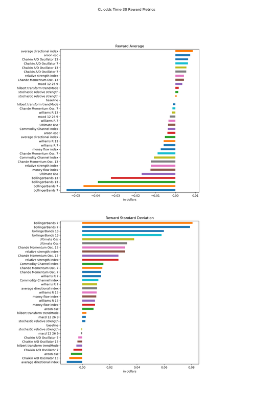 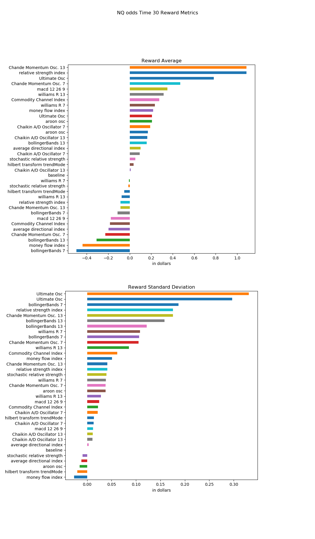 These charts indicate that many of the indicators decrease the average reward but increase the standard deviation. It's worth noting that the average directional index both decreases the risk and increases the reward while decreasing the standard deviation of the reward. The mode was increased by both the Chande Momentum Osc. 13 [(indData.cmo < -50.0)] and relative strength index [(indData.rsi < 25.0)]. We can look at risk and reward individually, but we can also look at them as a ratio. Odds DensityThe previous charts showed the effects that these indicators have on risk and reward, but what about density? Do these indicators have an effect on how likely it is that *something* will happen after you enter the market? Shown in the charts is a 'No Odds' situation. This describes a condition where the trader enters the market and both directions carry more risk than reward. In other words, probably in the middle of volatile congestion. This condition happens more on a shorter time frame since the market generally moves one way or the other given enough time. 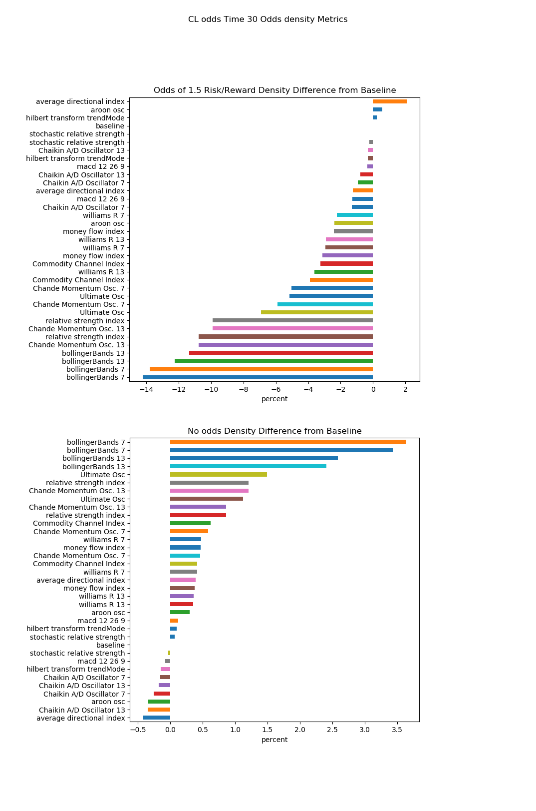 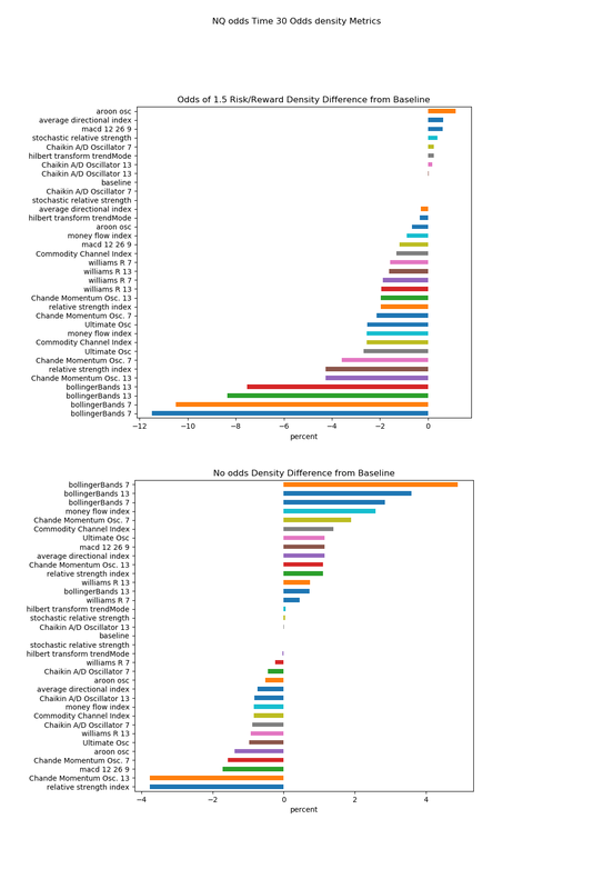 Most indicators increase the possibility of no odds (bad) and decrease the odds density of have a ratio of 1.5 to 1 or higher for the tested conditions by varying amounts. Again, this isn't the complete story. We need to consider how often these indicators happen, both on a daily basis and number of raw minutes. Frequency of Occurrence (Filtering)The following charts show how often the conditions indicate happen. Two charts are used, both in percentage. Once shows the percentage of minutes while the other shows the number of unique days. If the number of days is low, we might consider either changing the indicator parameters OR investigate to see if the indicator is telling us about a certain market condition or type. 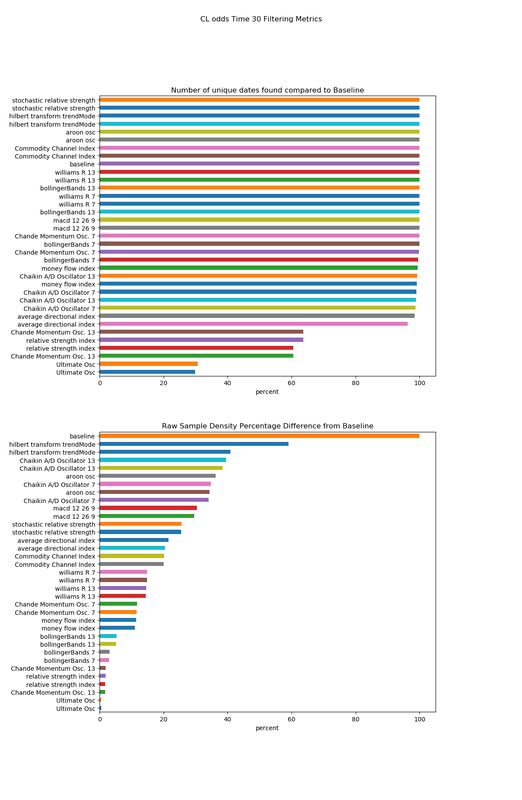 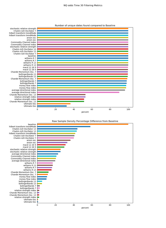 These charts show that Ultimate Oscillator as well as RSI occurs the least, both in terms of minutes and day. Most of the other indicators happen on greater than 95 percent of the days Concluding thoughtsTrading is a multi-dimensional problem. You can combine indicators to create
trades with a certain entry condition. You can also study the sequences. Let's say you enter a trade based on have a low ADX to minimize your risk as shown by the graphs. The trade then moves into one of the Williams Percent R conditions. You now have some edge on the likely direction (for the next 1/2 hour), but knowing that your risk has gone up, you can keep your stop a little looser. Bollinger Bands are great at detecting direction, but that knowledge comes at a cost in terms of risk and reward. You can use use the chart data to find a lower risk entry by using either a low ADX or not being too far to either side on a William Percent R. The combinations are endless! It's nice to see that these indicators do roughly the same thing on both markets, but one can use parameter tuning to be the most effective for a given market. Thoughts, comments, questions???
5 Comments
|
AuthorBill has been trading for more than 10 years now around still likes to write programs that analyze market behaviors. ArchivesCategories |
 RSS Feed